
13 Jul 2022
Introduction
The global climate is rapidly getting warmer through the burning of fossil fuels and accelerating rates of deforestation around the world. This is already leading to more severe heatwaves and flooding, including here in the UK. In some urban areas this is being exacerbated through the loss of green space and the removal of trees. Global temperatures are already 1.1 degree above pre-industrial levels. And we are facing the prospect that temperatures may increase to 1.5 degrees, 2 degrees, or even 3 degrees above pre-industrial levels this century, depending on what actions are taken to curtail fossil fuel use and deforestation
We need to know who is most vulnerable to the health impacts of global heating so we know where to prioritise any measures to help impacted communities.
The research
Research by a team at the University of Manchester has identified which neighbourhoods (average 1700 people) in the UK are most socially vulnerable to the health impacts of heatwaves because of where they live and the make-up of the local population (the data can be downloaded here). This helps to identify which areas most need help to prepare for heatwaves, respond when they occur and recover afterwards. The researchers used data produced by the University of Bristol on recent past and future heat levels. So what does this tell us?
Which neighbourhoods are most affected by heat now and in the future?
The research identified which neighbourhoods across England already experience levels of “hot weather” over the summer period (1 June to 31 August). According to Public Health England (now UK Health Security Agency), there is evidence that excess heat-related mortality is first detectable above an absolute temperature threshold of ∼24.5°C. This is what we are calling hot weather (an average of 24.5°C or more for five or more days over the summer period).
In England 77% of neighbourhoods (25,250) have typically experienced hot weather in the recent past (as an average over the 30-year period 1990-2019). The proportion that will be exposed to hot weather every year increases as global temperatures warm (see graph). The research maps these neighbourhoods and identifies which local authority areas are most impacted now and in the future. In addition to these new norms, there will be extreme hot weather events as we have seen in the past (2019, 2003, 1995, 1990, 1976, etc), and it is likely these atypical summers will become more frequent.
The research also identified that no neighbourhoods have typically been exposed to “very hot weather” in the recent past (an average of 27.5 0C or more for five or more days over the summer period) but that at 1.5 degrees of warming approximately 48% of neighbourhoods will be typically exposed to very hot weather and this proportion increases further as global temperatures increase.
The research found that no neighbourhoods typically experienced dangerously hot weather in the recent past. Dangerously hot weather is 30 0C or more on average for five days during the summer. But that this changes significantly if global temperature increases reach 3 degrees. 300C is the average temperature when the UK Health Security Agency issue a Heat-Health alert (there is some minor regional variation for when a Heat-Health alert is issued). This level is what we are calling ‘dangerously hot weather’.

Table 1 – number of neighbourhoods and population exposed to ‘hot weather’, ‘very hot weather’ and ‘dangerously hot weather’ every year in England.

Which neighbourhoods are most socially vulnerable to high heat?
People in some neighbourhoods are more vulnerable than others to the same level of heat. This can be for many reasons, such as a person’s sensitivity to heat stress and dehydration because of age or ill-health. Neighbourhoods with a high proportion of elderly people or toddlers are therefore more vulnerable.
Additional environmental factors can heat up or cool down local areas too. For instance, neighbourhoods which are less green tend to be hotter, and have fewer green spaces in which to shelter (gardens and parks). The type of people’s housing also matters.
Mobile homes can’t be cooled as much as other kinds of housing and high-rise buildings can also overheat. Distance from health facilities has an impact and social factors such as community ties and social isolation can affect the extent to which help is on hand. People in some neighbourhoods are wealthy enough to adapt their homes to hotter weather (e.g., shutters, ventilation and cooling) but not everyone is able to afford adaptations.
The researchers identified 17 domains (groupings of indicators) and over 40 separate indicators to identify the neighbourhoods that are, in theory, most socially vulnerable to heat. For the purposes of this research, we have identified the top 20% most socially vulnerable neighbourhoods (high social vulnerability neighbourhoods). There are 6,597 neighbourhoods of these neighbourhoods (population 12.4 million).
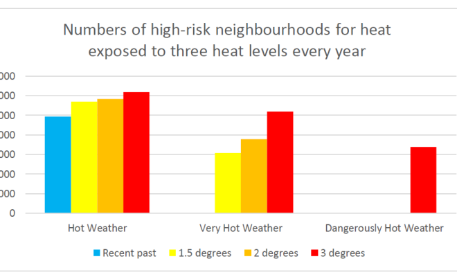
By combining data on current and potential future heat exposure with data that identifies the high social vulnerability neighbourhoods the researchers have identified those neighbourhoods that are ‘high-risk neighbourhoods for heat’. The graph and table below shows how the numbers of these neighbourhoods exposed increases with global warming as does the severity.
Table 2 – numbers of high-risk neighbourhoods for ‘hot weather’, ‘very hot weather’ and ‘dangerously hot weather’


Where are the high-risk neighbourhoods for heat?
Data is available for all local authority areas and at a regional level identifying the high-risk neighbourhoods for heat that are exposed to hot weather, very hot weather, or dangerously hot weather for different levels of global warming. There are 3,001 high risk neighbourhoods for heat that are already exposed to hot weather and will be exposed to very-hot weather with 1.5 degrees of warming and dangerously hot weather at 3 degrees. Almost six million people live in these neighbourhoods. It would make sense to prioritise publicly funded adaptation at these neighbourhoods first, although of course other neighbourhoods will need adaptation advice and in some cases funding.
Table 4 below (Appendix) identifies the number of these 3001 neighbourhoods by local authority area for the top 30 local authority areas (these areas account for almost three-quarters (73%) of all these neighbourhoods.
Environmental justice
Friends of the Earth has married the data analysis carried out by the University of Manchester with research carried out by Leeds University into the carbon footprints of neighbourhoods. We found that high-risk neighbourhoods for heat have lower carbon footprints than average (see table 4 and graph). Assuming this was also true in the past, this means the most vulnerable communities are less responsible than average for causing climate change but will bear the brunt of it.
Table 3 - Carbon footprint of high-risk neighbourhoods for heat and average neighbourhoods.

Carbon footprint data from Morgan, Malcolm, Anable, Jillian, & Lucas, Karen. (2021). A place-based carbon calculator for England. Presented at the 29th Annual GIS Research UK Conference (GISRUK), Cardiff, Wales, UK (Online): Zenodo. http://doi.org/10.5281/zenodo.4665852

We have also identified a strong correlation with race, using data on ethnicity by neighbourhood supplied by UCL/Consumer Data Research Centre. People of colour are 4 times more likely to live within one of the priority neighbourhoods for adaptation that white people (a 1 in 3 chance, compared to a 1 in 12). The average proportion of people of colour in high-risk neighbourhoods for heat is 28% compared to a national average in English neighbourhoods of 9.5%.
Policy implications - where is adaptation spending most needed?
The Government is producing a new Climate Adaptation Strategy for England. In June 2021 the Climate Change Committee produced a scathing report on the UK’s preparedness for climate change, stating “Alarmingly, this new evidence shows that the gap between the level of risk we face and the level of adaptation underway has widened. Adaptation action has failed to keep pace with the worsening reality of climate risk.”
Adaptation spending is particularly important and is needed for measures such as green infrastructure (trees, etc) to provide shade and cool the area, as well as household measures (insulation, ventilation and shutters), and spending to improve warnings and provide response options (e.g., cool community centres for the worst of the heat). The government is failing on spending on insulation and spending on other measures is close to or non-existent.
However, neighbourhoods at high-risk of heat impacts are also a result of the social vulnerability of the population. While some of these factors are not the result of poor policy (e.g., age) others are (for example, income, crime). Action to reduce inequalities, necessary in themselves, will also reduce heat-risk.
Note on researchers and data sources
The Research was led by Professor Sarah Lindley and colleagues at the University of Manchester. Her team carried out the identification of high-risk neighbourhoods for heat. The Temperature data they used were provided by University of Bristol based on research reported in Kennedy-Asser et al (2022) and using UKCP18 data at a 12km resolution. A summary of the data and methodology is available on Friends of the Earth website. A detailed methodology and the full set of data will be available at https://www.climatejust.org.uk/ after the summer.
Appendix
Table 4– Top 30 local authorities for the greatest number of priority neighbourhoods for heat adaptation
(Those neighbourhoods that are high-risk neighbourhoods for heat already exposed to hot weather, will be exposed to very hot weather under 1.5 degrees, and dangerous hot weather at 3 degrees scenario).